宣传中心
首页 > 宣传中心
凯利摩尔涂料:独屋挑战设计专题:没有想到您会拥有一幢蓝色房子?


尽管在一年前我们刚搬进来的时候,我就想把我们艺术工作室的建筑外墙粉刷一下,但在我们清理和修复这个很酷的老房子之前,多花点时间考虑给其选择合适的颜色肯定是值得的。

As much as I wanted to paint our art studio building as soon as we moved in a year ago, it was worthwhile taking the time to consider my color options as we gutted and repaired this cool old place.


以下您可以快速浏览一下,我为任何建筑选择涂料颜色的过程,以及如何找到完美的、与之匹配的、和让其焕发奕奕光彩的颜色。

Here's a quick look at my process for choosing paint colors for any building, and how it helped me arrive at the perfect color for us.


·照片旁白:(我们的工作室位于一个转角地段,面对着连绵起伏的山丘,有着开阔视野 


需要考虑的要素:

Consider the set things:


建筑风格——这是一幢规模较小且不具任何特色的建筑,门窗尺寸与建筑极不协调,简单的现代建筑外形,有着圆齿形壁板的侧檐。

· Style of the building - fairly small non-descript building with a funny combination of mismatched window sizes, a simple modern shape, and scalloped eve siding.


地理位置——位于小镇边缘,可以俯瞰着长满橡树的连绵起伏的山丘。景色随着季节的变化而变化,令人陶醉。

· Location - on the edge of town overlooking rolling hills spotted with oak trees. The views are amazing and change dramatically with the season. 


 · 照片旁白:(我们的邻居虽然不多,但他们每天都会开车经过我们所在的转角 


 · 照片旁白:周围上坡上草的颜色会随着季节的不同而变化,从炽橙色到亮绿色。 


您想实现的效果:

What do you want to create?:


一些感觉虽然传统但不失新颖的东西。 这附近的大多数房子都是白色、棕色或绿色的。虽然这些颜色都很漂亮,但我想和它们的颜色有些对比及反差。

· Something that feels traditional but fresh. Most homes around here are white, tan, or green. Lovely colors, but I want to rev things up a bit.


相比工作室,我更想要我们的房子有着一个与众不同的颜色,所以我需要的颜色将看起来很棒,内敛而不张扬。

· I want our house to be a different color than the studio, so I need colors that will look great (not distracting) together.


应该是让整个建筑看起来和谐统一并干净利落的颜色。 整个建筑必须是使用同一种颜色。

· Something that makes the building feel unified and clean. The entire building has to be one color.


缩小选择范围

Narrow down your options:


我马上翻看起我们最新的扇形色卡,历史经典色卡(The Historic Color Set),这是我们将美丽的历史传统色彩做的一本集合色卡。 这一步就把我的选择范围从凯利摩尔涂料的3000多种颜色缩小到110种颜色。 


· Immediately I went to our newest fandeck, THE Historic COLOR SET, with our beautiful collection of traditional colors. This step alone narrows my options from almost 3,000 colors to a 110 hues with a proven past.


我把白色系列和绿色系列的色卡放在一边。 (记住我前面说过我想要的是一些不一样的颜色)这让我的颜色选择减少到了50种左右。


· I set aside the white and green colors of the deck aside. (remember I wanted something a little different) This brought my color options down to about 50.


考虑对你来说印象最为突出的颜色:

Consider the colors that stand out to you:


当我在在一天中不同时段不同的光线下绕着这幢小楼走的时候,我就已经被被蓝色所深深吸引。HLS4227(迷雾蓝Stieglitz Fog)是历史经典色中最有深度的蓝色之一,在成群的橡树林、马路对面的黄色山丘以及天空的映衬下,这感觉太令人惊叹…… 这个颜色深沉又不失柔美,并能在周围植物的映衬下,显得温馨恬美。


· As I walked around the building in different light at different times of day, I was drawn to the blues. Stieglitz Fog HLS4227 is one of the darkest blues in THE Historic COLOR SET, and it felt amazing against the oak trees, the yellow hills across the street, the sky... It has a soft warmth that enhances the warm plant colors around it.


我知道深一点的颜色似乎会退色,但这在这种情况下,一切都是完美的。 为什么? 就像我想要一个华丽动人的涂料颜色一样,我真心希望这样配色能突出我们的橡树林以及自然景观,这才是重点。 


· I know that darker colors seem to recede, which in this case is perfect. Why? As much as I want a gorgeous paint color, I really want our oak trees and natural landscape to be the focus. 


我选择颜色的一般原则是,如果立面线条和门是建筑物中漂亮的建筑元素,我就会用与主体不同的颜色来进行突出涂饰。


My general rule for placing color is that I only paint elements like trim and doors in a different color from the body if they're beautiful pieces of architectural.


在这个案列中,如果选用不同的颜色来涂饰,将突出原本并不协调和令人尴尬的门窗和侧裙护檐比例。 所以我选择把所有的东西都涂成蓝色,除了房顶新安装的闪烁金属围挡和房子背面的市政箱子,它们的自然金属颜色,很容易让人有着现代工业的触感。 


In my case, painting the trim would've highlighted the mismatched windows and awkward scale of the overhang. So I chose to paint everything blue except the new metal flashing at the top and utility boxes on the back in their natural metal color for an industrial touch.


花点时间考虑一下您房子的风格和细节,景观和周围环境,以及每天你想要的感觉,这将帮助缩小您的选择范围,直至找到最适合您的心仪颜色。 


Taking the time to consider the style and details of your house, the landscape and surroundings, and how you want to feel when you pull up to it every day will help you narrow down your options to the perfect color for you.


本案主色:HLS4227       


时间:05-07-2022
凯利摩尔涂料 :2022年06月宣传海报

6.01-国际儿童节

6.03-端午节

6.05-世界环境日

6.06-芒种

6.19-父亲节

6.21-夏至

6.23-奥林匹克日

时间:05-05-2022
凯利摩尔涂料:独屋挑战设计专题: 梦幻居家办公室

并不总是那些华丽的装修能让我能大吃一惊,而是那些完全出乎自己意料的配色方案,让我不禁微笑着想:“为什么我没想到呢?”  

It's not always the big fancy makeovers that knock me off my socks- it's the ones where the color scheme is totally unexpected and makes me smile as I think, "why haven't I thought of that?"


作为有着影响力《Gold A La Mode》的时尚博主,卡拉·欧文的家庭办公室装修对我的印象正是如此!谁能想到HLS4245(Top Hat Tan),凯利摩尔的历史经典颜色之一,在方格地毯和藤条编织家具的衬托下,可以看起来具有如此高级流行感(和妙不可言)?! 

Gold a La Mode influencer, Cara Irwin's home office makeover has exactly that effect on me! Who knew Top Hat Tan, one of our Historic Colors could look that current (and fantastic!) with a checkered rug and wicker sconce?!


让我从头说起……

But let me start at the beginning...


卡拉从一个非常糟糕的房间开始,在她买这个房子之前,这个房间已经闲置了5年。 墙壁被烟草熏得像整个房间被尼古丁浸透一般,还有窗户处简直无法直视…… (查看她的博客https://goldalamode.co/ 了解更多关于她本次装修的细节!)  

Cara started with a pretty sad room in a home she purchased which was unoccupied for 5 years before she bought it. The walls were drenched in nicotine SAP and there was a window that literally looked at nothing... (check out her blog for more details on her journey!)


当她被接受为的特色设计师时,我们便向她邮寄了我们的色卡以便她能够开始工作。 赞助《独屋挑战》对我们来说是应该是一个很简单的事情,因为我们喜欢看到设计师想出的不同颜色搭配组合,这是一个很好的方式,可以让人们知道我们有3000多种美丽的涂料颜色,以及我们可以快速配送至美国本土的48个州的任何地方。  

As soon as she was accepted as a Feature Designer for  One Room Challenge we sent her our colors so she could get to work. Sponsoring One Room Challenge is a no brainer for us because we love seeing the color combos designers come up with, and it's a great way to let people know that we have over 3,000 beautiful paint colors that we can ship to the 48 of our United States!


回到《Gold A La Mode》博主现场,卡拉选择了我们的一种历史经典颜色,HLS4245(Top Hat Tan),这是一种柔滑细腻的融合蜀葵粉和莫夫紫的粉褐色,充满了怀旧之情,但将这个颜色涂饰在她的办公室里,感觉却如此有朝气感和清新感。 对于像她这样的老房子来说,这个颜色是用来翻新的完美选色方案。 

Back to Gold A La Mode... Cara chose one of our historic colors, Top Hat Tan HLS4245, a creamy dusty marshmallow mauve that's steeped in nostalgia but feels so young and fresh in her office. It's the perfect color for updating a vintage home just like hers.

卡拉以一种全新的方式将如此多的经典元素融入到生活,这让我印象尤为深刻。 她把一个原来又小而又笨拙的壁橱,改造成了一个美丽的拱形壁龛,并使用复古风格的灯具来创造一个好玩又不缺个性风格的新颖的方案。

I'm especially impressed by Cara's vision for bringing so many classic elements to life in a new way. She turned a tiny awkward closet into a beautiful arched niche and used vintage inspired lighting to create fresh solutions with a playful style.


我很高兴看到卡拉把踢脚线和装饰线条都刷得和墙壁颜色一致, 这是让房间视觉感觉更宽敞的最简单也是最好的方法之一。 点缀的镜球,能给人带来快乐的凯利威尔斯特勒式的触摸感!

I love seeing Cara's choice to paint the baseboards and all trim to match the walls. It's one of the easiest and best tricks for making a room feel more spacious. The mirror balls are just the happiest Kelly Wearstler-esque touch!


通过一个简单的配色方案,卡拉· 欧文可以在直线和曲线之间创造出一种令人愉悦的感觉,体现出很强的空间营造感和功能性,而又不会让访客有拘谨的感觉。

With a simple color scheme, Cara played could play with the contract between straight and curved lines for a happy feel that's very organized and functional but not too serious.


用凯利摩尔KM4571(Cobblestone Street)作为配色使用在房间的挑高部分及天花,增加了柔和的触感,而不会引起人们对屋顶及天窗区域的过度关注。这样,她成功地用颜色让房间感觉尽可能的开放。 

Adding Cobblestone Street KM4571 adds the softest touch to the highest part of the room without drawing attention to the dormered ceiling areas. Again, she uses color to make the room feel as open as possible.


想要了解更多的细节和令人难以置信的技巧和创意,请在Instagram上关注并查看@goldalamode,也可以访问博客https://goldalamode.co/  

For more details and incredible tips and ideas from Gold A La Mode, check out Cara's website goldalamode.co and Instagram@goldalamode


要查看更多精彩的“独屋挑战”揭秘细节,请查看我们的ORC揭秘页面,并可在Instagram上关注 “One Room Challenge”。 

To see more amazing One Room Challenge reveals, check out our ORC Reveal page and be sure to follow One Room Challenge on Instagram.


本案主色:HLS4245KM4571


时间:04-22-2022
凯利摩尔涂料:门厅这样配色,邻居将很乐意敲响您家大门


大门是千篇一律红色、白色或工厂化防火门的日子将一去不复返了。 今天,您可以自由地用一种大门的颜色来突出您的个性,它可以让整个房子看起来更明亮,并可以给大家分享一点您私人风格。

Gone are the days when front doors were red, white, or stained wood. Today, you can feel free to make your mark with a front door color that brightens the look of your whole house and shares a bit of your personal style.


下面是我选出的我最喜欢的11种门厅配色方案,推荐给您。这些方案中,有些是我在做颜色咨询方案时为客户挑选的,有些是我在街区闲逛时发现的,还有一些是从我们的图片库中找到的。 我们把它们挑选出来,并认为会给您带来感同身受的的颜色建议,在您决定做计划之前,可以先尝试一下我们的这些想法建议。 我们各家零售门店有颜色样本和夸脱装的色样,您可以到店查看实际颜色和购买样品。 好了,让我们开始吧!  

Here are eleven of my favorite front door colors. Some I selected for clients back in my consulting days, some I found walking down the street, and some we sourced from our image library. We added the color suggestions that we think will give you the same look and feel, but always give these ideas a try first before committing to your plan. We have large COLOR Swatches and Sample Quarts you can purchase online. Okay, let's get started!


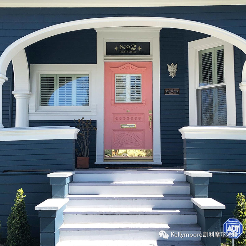
现在,“蓝色的房子”正在走向流行强势。 我喜欢这个房子,将一个非常传统(以及潮流!)的室内装饰蓝色用于其外部墙面装饰。这真是太好了! 为什么在门厅使用这样的配色会感到害羞呢? 当您从转角处沿路走来,看到这款华丽的泡泡粉色,感觉会非常棒! 这座房子保留了历史的感觉,同时也完全有着现代时尚的感觉。 

Blue houses are trending hard right now. I love how this house boasts a very traditional (and popular!) interior blue for the exterior. So good! And why be shy with the front door? This gorgeous bubblegum pink feels amazing all the way from the street! The house retains it's historic feel and feels totally today at the same time.


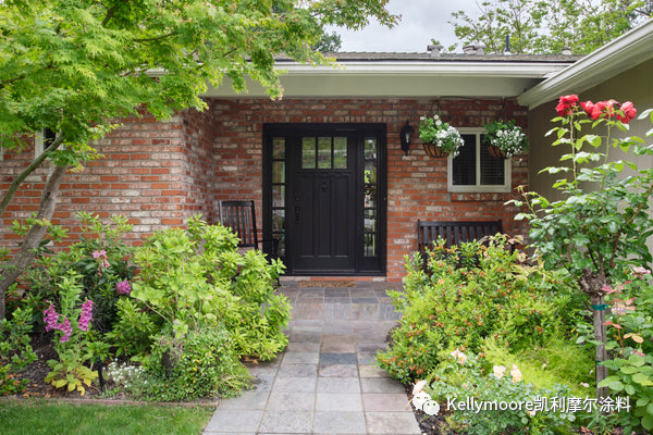
我最喜欢的客户之一就住在这座房子里。 在解决了室内的配色选色问题后,她让我把她传统的牧场风格的房子做得更加开放和通透。 她最近才装了一个又大又漂亮的前门(如下图),她很喜欢,但还是想要来个彻底翻新。 

One of my favorite clients lives in this house. And after tackling colors for her interiors she asked me to make her traditional ranch style home to feel more open and airy. She had this big beautiful front door installed fairly recently and loved it, but wanted a total refresh.


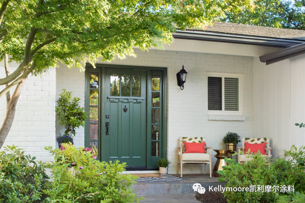
侧墙和檐沟线条我们使用了柔和粉白色调和去黑灰色色调,使房子整体感觉更大、更高、更现代。 现在我们只需要一个漂亮的前门颜色。 我们曾经考虑了几种颜色,从传统的红色到流行的黄色。 但感觉最好的是这种令人惊叹的绿色(如下图),感觉大胆和新鲜,同时也与其前花园常年展现的新鲜绿色景观相得益彰。 

Painting the siding and trim with a chalky soft white and off-black for just the facia/gutters made the house feel bigger, taller, and more modern. Now all we needed was a great front door color. We considered several colors ranging from traditional red to popular yellow. What felt the best was this amazing green which feels bold and fresh while also showing off the fresh green landscaping she tends to year-round.


白色房子的美丽之处在于,你可以完全通过前门的颜色来定义建筑的外观。 我以前几乎每天都经过这所房子,我很喜欢这种蓝色,感觉就像希腊周围的深邃大海。 传统的大门和宽大的棕榈让房子有一点古老岛屿的感觉,有一种帝王般的感觉,更有一种精心保护的历史厚重感。  

The beauty of a white house is that you can totally define the look of that building with the front door color. I used to walk by this house almost every day and just love this blue hue that feels like the sea around Greece. The traditional gate and expansive palm give the house a bit of an old island feel with a regal-ness that only well-kept aging can create.
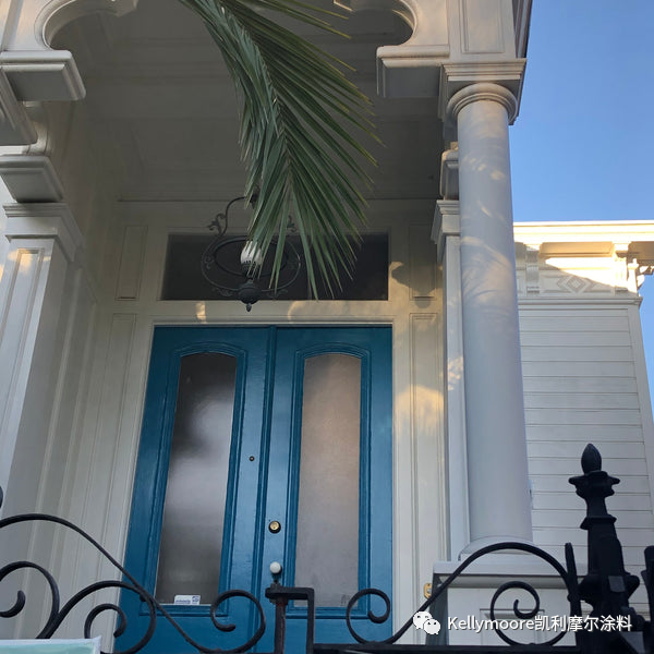


我喜欢这种意想不到的涂料颜色组合,这房子让我大吃一惊!  

I love unexpected paint colors combos and this house blew me away!


我并不认为桃红色调是一个特别大胆的颜色,但这肯定是一个大胆和美妙的前门配色,由于这位房主选择比较沉闷的侧墙和线条颜色而定。 如果没有浅色或明亮的颜色细节来平衡这些暗色调,这个配色方案可能会感觉非常沉闷。 但是,在这里,裸露的楼梯砖和桃红色的柔和前门体现和创造了一个欢迎光临的小道,软化了这个本来略显厚重的配色方案。 


I wouldn't consider peach a particularly bold color, but it's a bold and wonderful front door choice by this homeowner with the somber siding and trim colors. Without light or bright details to balance the dark palette, this color scheme could feel a bit dreary. But, here the exposed brick stairs and peachy soft front door create a welcoming path and soften this sophisticated color scheme. 
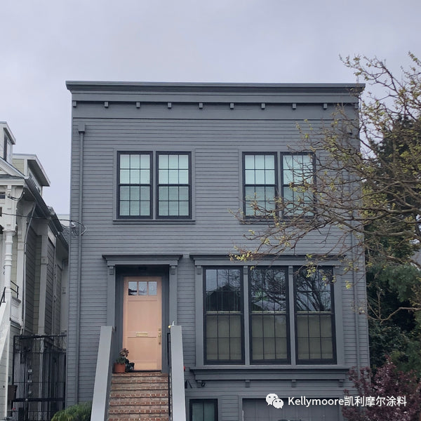


我们很多人的房子的前门都被街道遮挡住了。 怎么会这样?  

I love unexpected paint colors combos and this house blew me away!

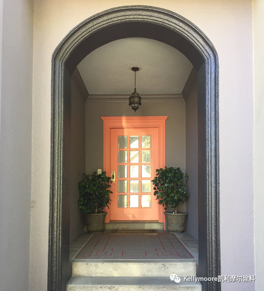
没有什么比华丽的门厅更能表达你的问候了。我的客户家有一个很深的门廊,所以我们在门和门框上涂上了明亮的甜瓜色,让它显得更突出和诱人。 把你的门和门框涂成相配的颜色可以让小一点的门视觉感觉更大,偏暗的门廊感觉更会更敞亮。 

Nothing says hello like a gorgeous front door, so for this deep porch at my client's house we went for it with a bright melon color painted on the door AND doorframe to make it prominent and inviting. Painting your door and door frame to match can make smaller doors feel bigger, and dark porches feel brighter.


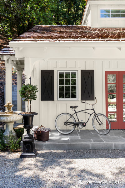
虽然白色现在仍然是室内和室外装饰的主要流行选择,但我确实注意到一个奇妙的转变,从完全冷色调转变为温暖的米白色,这会让我们的家,感觉更休闲和宜居。 

While white is still a popular choice for interiors and exteriors right now, I'm definitely noticing a wonderful shift from stark cold tints to warm creamy off-whites that are friendly allowing our homes to feel more casual and livable. 


当您为您的白色房子选择装饰颜色时,不要害怕突出其最好的建筑元素。 在这里,房屋本体和线条被涂成深乳白色,而农场风格的百叶窗是黑色系的,法式前门是红色系的。 这些颜色是非常传统的农场和乡村风格,但以一种有趣的新方式来使用,以此来突出其最棒的建筑特征。

When it comes to choosing trim colors for your white house, don't be afraid to feature only the best elements. Here the body and trim are painted a deep creamy white, with farm style shutters dressed in black and French doors in red. These colors are very traditional for farm and country style, but used in a fun new way that features the best architectural features.


即使你的房子是,比如说,复古的(您懂得:-)),您仍然可以使用有趣的前门颜色来装点整体外观,而不会彻底改变其历史悠久的感觉。 

Even if your house is, let's say, vintage :-) you can still play with fun front door colors to brighten the overall look without drastically changing the historic feel.
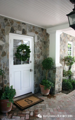


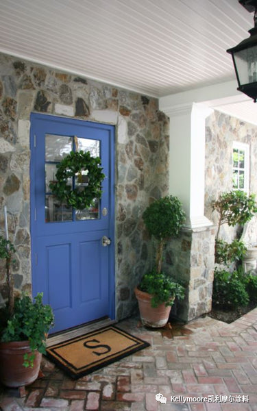
可以考虑用意想不到的颜色创造一点对比,有意地使其从房子其他材质中脱颖而出。 这里温暖的石头颜色与浅靛蓝色的前门相辅相成。 对于一个温馨的老农舍来说,它既新鲜又有趣,而又不会显得太过古怪。 

Consider creating a bit of contrast with unexpected colors that intentionally stand out from the materials of the house. Here the warm stone colors are complemented with a light indigo blue front door. It's fresh and fun without being too outlandish for a sweet old cottage.


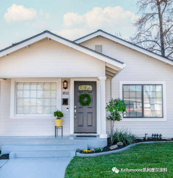
像这样一座线条简单的平房,最好的风格是来装饰一个别具用心的前门颜色。 在这里,一名房地产经纪人为整栋房子选择了中性的涂料颜色,然后用花盆和鲜花点缀出一些细节颜色,向潜在的房主展示,为这个朴素的房子添加个人风格是一件多么容易的事情。


Simple bungalows like this are one the best styles to decorate with an intentional front door color. Here a realtor chose neutral paint colors for the entire house then added small bursts of color with the planter and flowers to show potential homeowners how easily they'll be able to add their own personal touches to this humble home.


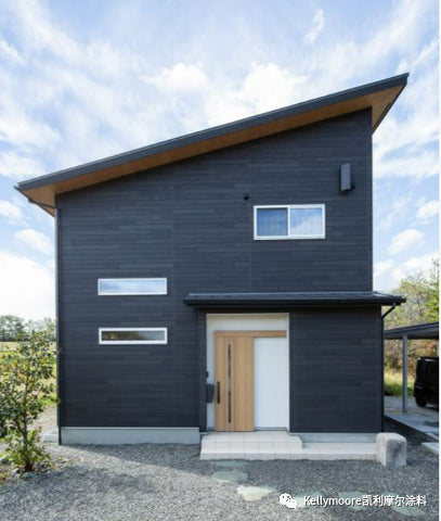
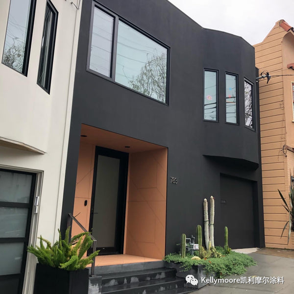
那么黑色调的现代住宅呢? 你仍然有很好的方案来确保突出门厅入口处。 我喜欢这个现代款式的门廊,用温暖的米色墙壁和在其之上的别致的蜂蜜色谷仓门来突出其整体存在。


So what about a dark modern house? You still have a wonderful opportunity here to make sure the entrance is prominent. I love how this modern porch is distinguished by warm white walls with a very chic barn style house in a soft honey hue.


这是另一个华丽的门厅,感觉非常新鲜清爽,非常适合这个有着桶状前脸的城市住宅的改造。 在这种案列中,业主聪明的选择单一铜陶土色的颜色方案来做了一种种微妙的平衡,将人们的注意力成功地吸引到了这个带有工匠风格的景观和入口。 


Here's another gorgeous portico that feels fresh AND fitting on this updated barrel front city house. In this case, the homeowners chose to balance a one-color scheme with a coppery terracotta porch that brings craftsman style attention to the landscape and entry.


这所房子的颜色布局让我非常惊奇,也让我会心地笑了,并且在想:“我从来没有想到过这个! 而它却又是那么完美!”  


I love being totally surprised by color placement and this house definitely made me smile and think, "I wouldn't have thought of that! It's perfect!"


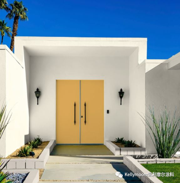
我们继续能发现黄色系的前门越来越受欢迎,不禁感到非常高兴。 黄色系是一种乐观的、令人惊讶的万能的家居颜色。 在这里,一个经艺术装饰的房子,有着厚重西班牙风格的门灯和比实际需求更大一号的门把手,在阳光的映衬下,加利福尼亚麂皮色调双开式大门获得了戏剧性的效果。 


We continue to see yellow front doors rise in popularity and I can't help but feel good about that. Yellow is such an optimistic and surprisingly versatile color for homes. Here, an art deco house with chunky Spanish style sconces and larger than life door handles gets a sunshiny reprise with California Chamois for dramatic double doors.


无论您觉得您的房子是太小了、太大了、太老了,还是太无聊了,退一步考虑一下给您的房子前厅换一个新颜色吧,这样可以彻底改变您及您的邻居对您家的看法。 您可能会惊讶于您得到了这么多的赞美(以及模仿!), 更重要的是,你可能会开始更热爱您的家了!  


Whether you consider your house to be too small, too big, too old, or too boring, taking a step back to consider a new color for your front door can totally re-define how you and everyone around you sees your home. You may be surprised by how many compliments (and copy cats!) you get. Even more important, you may just start to love your home again. 


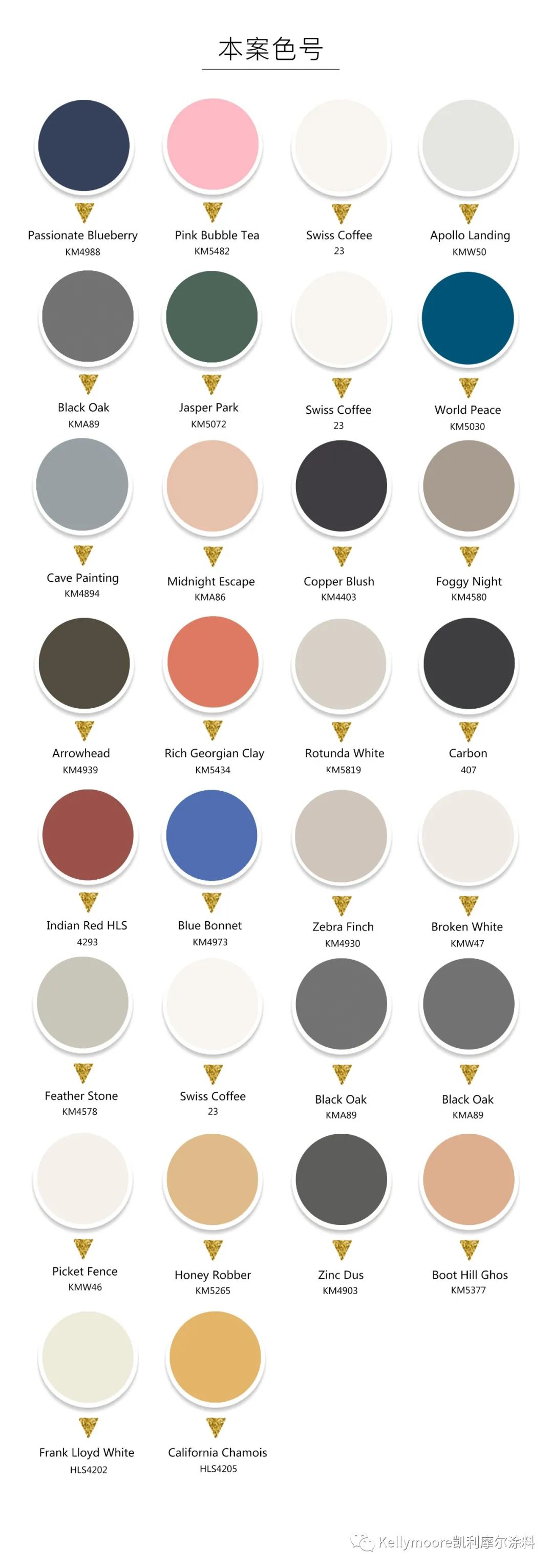
本案主色:KM4988KM548223KMW50KMA89KM507223KM5030KM4894KMA86KM4403KM4580KM4939KM5434KM58194074293KM4973KM4930KMW47KM457823KMA89KMW46KM5265KM4903KM5377HLS4202 HLS4205        

时间:04-11-2022
凯利摩尔涂料 :2022年05月宣传海报

5.01-国际劳动节

5.04-五四青年节

5.05-立夏

5.08-母亲节


5.12-国际护士节

5.18-国际博物馆日

5.21-小满

5.31-世界无烟日


时间:04-08-2022
凯利摩尔涂料:设计访谈:哪个是您的梦中色彩?


【人物照片】肖像由BLK工作室提供,活动照片由德米特里 ·菲利普提供


在马泰尔·哈斯利的第二季展览《追梦人》中(第一季展览详见我们前面发布的文章:《用颜色连接你我》 ),他的注意力更多地转向内心深处,过滤掉疫情期间的各种来源的信息和现实,专注于创造一个充满希望和灵感的新时代。 

For Martell's second exhibition, Dreamcatcher, (see Part l for his first) his attention turned more inward, pushing against the messages and realities of the pandemic, to focus on creating a new time for hope and inspiration.


作为费尔泽大学工作室的创始人,马泰尔说:“我看到很多关于所谓的 ‘新常态’ 的可怕评论。 这个展览就是为了抵制这样一种悲观想法,即恐惧和死亡的心态不得不成为我们的行事方式。 难道我们还不能向往更光明的明天吗?”  

As Martell, founder of Uni.Verse Studio, puts it, "I was seeing so much dreadful commentary on what was being called our 'new normal'. This exhibit was about resisting the idea that this mentality of fear and death had to be how we operate. Couldn't we could still dream and aspire toward something brighter for tomorrow?"


马泰尔调查了世界各地有着不同背景、年龄和环境的人,以充分了解他们对自己的梦想的感觉,以及他们对自己周围人的期望。 

Martell surveyed people around the globe of various backgrounds, ages, and circumstances to find out how they were feeling about their own dreams and what they hope for the people around them.


“想象自己之外的东西意味着什么?” 我们的梦想,或者他人的梦想是如何塑造我们所了解的世界的?  

"What does it mean to imagine something outside of yourself? How have our dreams, or the dreams of others molded the world we know?


这些沉思的结果就体现在一个立方体的星座结构中,每个立方体表面有来自参与者的4个答案,形成了一个充满希望和惊奇的信息集合。 承载这些想法的展览结构是一个镂空的黑色框架,似乎消失在开放的天空下。 

The result of these contemplations was a constellation of cubes, each with 4 answers from a participant, to form a collective message of deep hope and wonder. The exhibition structure that held these thoughts was fittingly a spare black framework that seemed to disappear under an open sky. 


一个像类埃舍尔的立方体,其超现实的摆放位置及其梦幻般的颜色,引导观众到一个发光的入口------追梦人自此进入。 当人们朝一个冰冷的蓝色球体迈步前行时,他们不得不抬起头来感觉和理解这个空间结构,并考虑下一步会发生什么。 

The surreal placement and fantastical colors of the Escher-like cubes directed viewers to a glowing dreamcatcher portal. The analogy wasn't lost that one had to look up to make sense of the space as they moved forward towards an icy blue sphere to consider 'what's next'. 

【人物照片】| 菈莎泊·琥玛留影

Portrait as left by Lethabo Huma


平台的表现张力让位于雾气模糊背景的艺术作品,它充满了好奇、怀旧、个人力量和大胆的乐观主义。

The intensity of the platform gave way to a fog-faded backdrop where artworks imbued a sense of curiosity, nostalgia, personal power, and bold optimism.

《我们的孩子是超级英雄》 作者: 拉吉·萨鲁斯

Our Children are Superheroes by Laji Sanusi

《查德威克·博斯曼》  作者: 克洛费亚·凯萨

Chadwick Boseman by Clophia Keesee

沙拉·派普斯的《梦境》

 'Dreamscape' by Shala Pipes

在这里,梦想被定义为“我的”、“你的”和“我们的”,把共同的人性带到我们每个人身上,每个人都是一个伟大社区的一部分。 

Dreams were defined here as those that are 'mine', 'yours', and 'ours' bringing a common ground humanity to all of us as individuals who are all part of a great community.


这些作品激发了观众之间的对话和交流,给了人们一种联系感和希望。 

The works sparked conversation and communion among viewers, which gave people a sense of connectedness and hope.


“我最喜欢的部分,”马泰尔回忆道,“是看着人们坐在长凳上,对着立方体进行反思。通过阅读和了解别人的梦想和想法,人们似乎添加了自己的希望和梦想,并把它们发射到太空,让更多的人能抓住和听到…..《追梦人》是一种现象,那就是即使在最艰难时期,我们也有共同的追梦能力。疫情将我们所有人在现实中联系起来,而我们如何克服疫情的真实故事将由我们梦想中的生动色彩描绘出来。 ”


"My favorite part" Martell recalls, "was watching people sit on the bench reflecting on the cubes. Reading the dreams and thoughts of others, they seemed to be adding their very own hopes and dreams and launching them into space to be caught and heard......Dreamcatcher was an acknowledgement that even in rough times, we share the universal ability to dream. The pandemic connected us all in our reality, but it would be the vivid colors of our dreams that painted the true story of how we'd overcome."


点击以下网址可了解更多关于马泰尔·哈斯利和他的创意服务及合作伙伴 http://www.uni-versestudio.com

Click to learn more about Martell Hasley and the creative services and partnerships he's fostering at  Uni. Verse Studio.


受《追梦人》的启发,这里有一些凯利摩尔的颜色,可能会有助于培养您的梦想,并激励您实现它们。 享受追梦!

Inspired by Dreamcatcher, here are some Kelly-Moore paint colors that might foster your dreams and encourage you to make them come true. Enjoy!


本案主色:KM5036 KM5067KM5673KM5662 KM4857 KM5116       


时间:03-28-2022
杭州楷模贸易有限公司 备案号:浙ICP备2022022646号-1