宣传中心
首页 > 宣传中心
凯利摩尔涂料:独屋挑战设计专题:令人仰视的如珠宝状的内饰


报名参加为期8周的“独屋挑战”活动是一回事,但在一个客户的豪宅里承担起改造三个宽大的房间却是另外一回事!  

It's one thing to sign up for One Room Challenge- an 8 week makeover campaign on Instagram. It's quite another to take onthree spacious rooms in the luxury home of a real client! 


但珠宝设计公司(Jeweled Design)的朱厄尔·马洛(Jewel Marlowe)似乎并没有在挑战面前退缩。 举个“栗子”,她改造了过时的屋内固定家具……

But Jewel Marlowe of Jeweled Design doesn't seem to shrink from challenges. Case in point, she transformed dated built-ins... 


使用我们凯利摩尔KM4995(Navy Damask大马士革海军蓝)的颜色,并大胆地使用大块花纹图案的墙纸作为背景衬托,极具抽象艺术的戏剧性特点,这真是一个令人称奇的改造。

Using our Kelly Moore KM4995 (Navy Damask Damascus Navy blue) colors and bold large-patterning wallpaper as a backdrop, this is an amazing transformation with the dramatic character of abstract art.


我喜欢她用色的泰然自诺的感觉,以及她以全新视角看待处理房间的能力。 在这个房间里,雪白的大型吊坠式的灯具以最好的方式震撼了我的心灵。 

I love her aplomb and capacity to see rooms with a completely new point of view. The largescale pendants in this room alone just blow my mind in the best possible way.


 但精彩远不止于此。But she didn't stop there.


餐厅位于一条通透的入口一侧,在入口有一个宽敞的楼梯。 朱厄尔·马洛选择了一种意想不到的颜色来装饰整个线条,KM5113(New Life 重生之色)来重新定义了这个房间,并为整个房子设定了意外的乐趣和惊喜的基调。

The dining room flanks an airy entryway with a grand staircase. Jewel chose an unexpected trim color, New Life KM5113, to define this room and set the tone for unexpected fun and surprises throughout the house.


  “重生之色”是一个令人惊讶的多用途的颜色,能让人感觉整个入户玄关空间大而又不失优雅,但又是那么地让人感觉随意而不拘谨,就算您带着杂七杂八的物品进入这个家门,您也不会认为自己进错了入口。

New Life is a surprisingly versatile color that feels elegant enough for a grand entrance yet casual enough to bring the groceries in without feeling like you've come in the wrong entrance.


位于餐厅的正对面,从餐厅穿过入户通道即是这个房间,因为它的巨大面积和一整面墙的过时固定家具,让人感觉无从下手,令人生畏。 

The room opposite the dining room and across the entry seems equally daunting with its massive size and another wall of outdated built-in shelves.


朱厄尔·马洛准确地选用了KMA83(Midnight Sky夜之深沉)的颜色,来重新给这些橱柜上色,然后又将壁炉重新铺上瓷砖,为她接下来添加的家具和壁纸,创造一个安静舒适的背景墙。

Jewel promptly painted these cabinets with sedate Midnight Sky KMA83 before having the fireplace re-tiled to create a quiet cozy backdrop to the furnishings and wallpaper she added next.


 想要了解更多朱厄尔·马洛令人惊叹的改造方案以及想咨询她的服务,请访问她的网站或Instagram关注她。

To see more of Jewel Marlowe's stunning makeovers and inquire about her services, go to her website or Instagram feed.  


在朱厄尔•马洛的设计中,我最喜欢的是引人注目的天花板色彩,她从一个房间到另一个房间的配色方案所带来的让人赏心悦目的历程,以及她从灯光到壁纸图案选择的一切敢于大胆尝试的勇气。 

My favorite features of Marlowe's designs are the dramatic ceiling colors, the journey she creates with color schemes from room to room, and her courage to go big on size with everything from lighting to wallpaper patterns.


                                       本案主色:KM4995KM5113、KM5113、KMA83      


时间:06-09-2022
凯利摩尔涂料 :2022年07月宣传海报

7.01-党的生日

7.07-小暑

7.23-大暑

时间:06-06-2022
凯利摩尔涂料:入户门厅完美呈现之16种颜色组合!

通常入户门均采用传统的颜色,例如红色、黑色、擦色木纹等。 您也可能见过一些蓝色、绿色和灰色的入户门,对吧?但这段时间以来,您可能会留意到邻居家的前门颜色开始流行起了一些明亮的颜色了。 

Front doors come in traditional colors like red, black, stained wood. You've probably seen some blue, green, and gray front doors too, yes? You may even be noticing some brighter colors popping up around the neighborhood these days.


那么,您的入户门“应该”选用什么样的颜色呢? 入户门的颜色有什么具体规定吗? 不,没有规定。 

So, what color 'should' your front door be? Are there any rules for front door colors? 

Nope. Not really.


很简单,只需要这种颜色能让您的房子看起来更漂亮,让您回家时能感到开心快乐,就这么简单。 

It just has to look great with your house and make you feel happy when you come home.


这里有16种最适合您入户门的颜色,以及入户门厅立面配色的一些小技巧,可以帮助您搭配好所有的颜色。 

Here are 16 door colors that could be perfect for you along with some exterior color palette tips to help you bring it all together.

如果您选择了一扇经典的红色门,你仍然可以保持它的新鲜感。 您选择一种现代风格的朴实红色,把门和门框涂刷成相同的颜色。 对于白色系的房子,您可以考虑采用黑色的窗户或百叶窗。 这样整个房子的外观看起来会更柔和,也会感觉房子更大、更明亮。

If you go with a classic red door, you can still keep it fresh. Look for a modern earthy red, and paint the door and door trim the same color. For white houses, consider only using black for the windows or shutters. It's a softer look that also feels bigger and brighter.
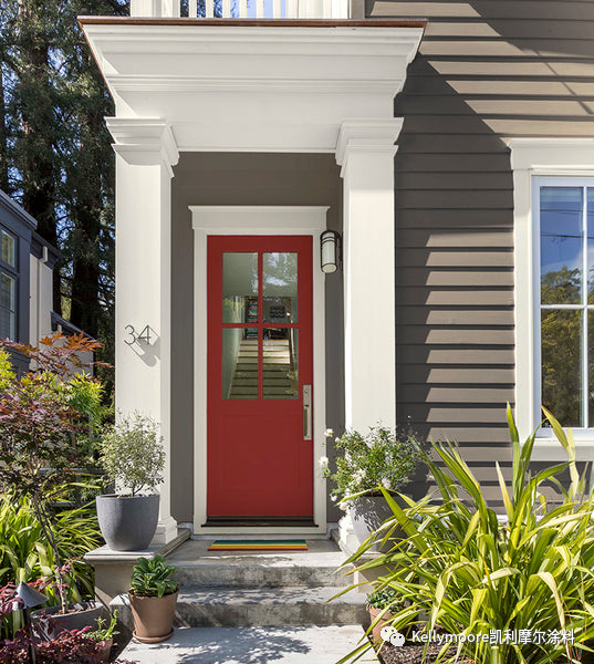
对于深色系的房子,深红色的大门可以使得房子立面与装饰线条之间的对比没有那么强烈。 您可以选用柔和的米白色或者纯白色来装饰线条。 通常在这种情况下,较低的对比度,会让整个房屋看起来感觉更饱满和时尚。

For darker houses, a deep lipstick red door can be amazing with lower contrast between the body and trim. Look for muted off-white trim color vs. stark white. Lower contrast in this case will feel more rich and sophisticated. 
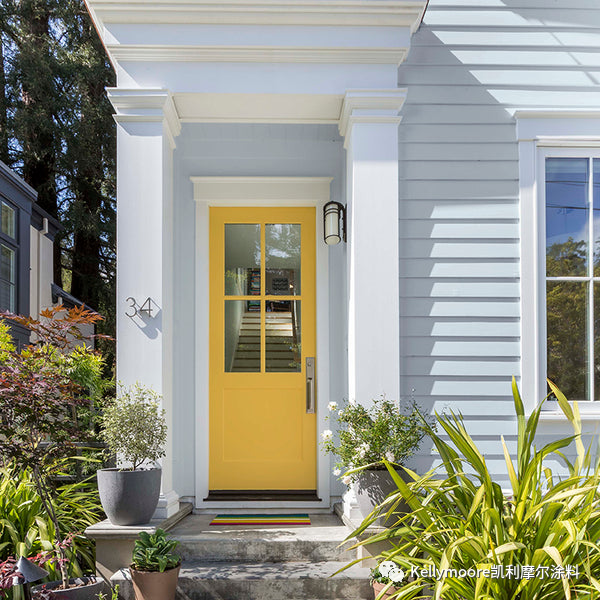
浅灰蓝色的外观的门厅颜色是令人惊讶的百搭通用的门厅颜色。这很令人沉迷于其中!  像这样的黄色大门已经流行了好多年了,到现在还没有任何落伍的迹象。

Light gray blue exteriors are surprisingly versatile for front door colors. So have some fun!Yellow doors like this have been popular for a few years now and show no signs of going away just yet.
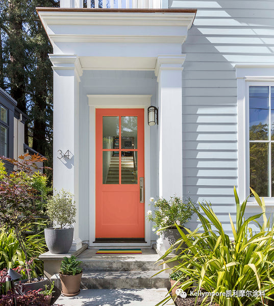
同样的房子以及配色,只是这个大门是漂亮的罂粟色所呈现的效果。  

剧透警告:我不想让您太犹豫不决,但如果这是我的房子,这肯定是您会看到的最终呈现的方案-------嘘,不要告诉他人。 

Here's the same house with a stunning poppy color for the front door.

Spoiler alert: I don't want to sway you too much, but this is the scheme you just might see on my house when we finally get it painted- sshhh
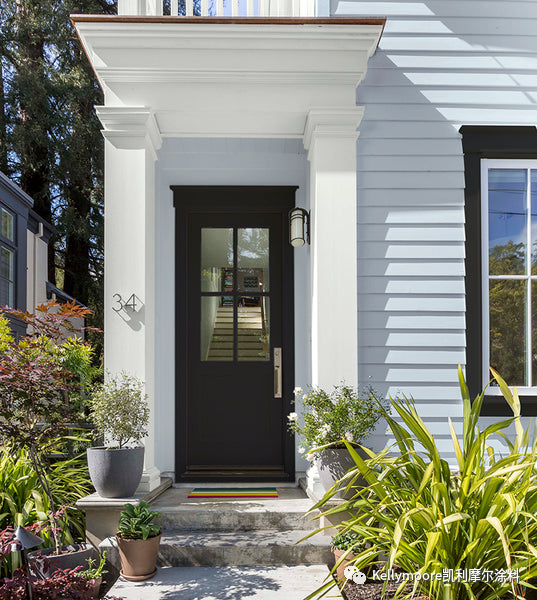
您甚至可以使用经典的黑色以及与之搭配的这个方案! 我喜欢这种忧郁的黑色烘托下的淡淡蓝色房子的感觉。 找到合适的颜色,与其说是“搭配”,不如说是找到一种能给你最佳感觉的组合。

You can even use classic black with this scheme! I love how this moody black brings out the blue in the house color. Finding the right color is less about 'matching' and more about discovering a combination that gives you the best feeling.
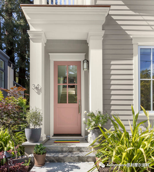
漂亮的粉红色系在我们家里一直占有一席之地。 在近几十年以来,我们能在从壁纸、地毯、瓷砖、胶木、浴缸甚至到抽水马桶等很多家居物品上发现类似的玫瑰粉色!

Pretty pinks have always had a place in our homes. In nearly every decade we find rosy colors on everything from wallpaper, carpeting, tiles, and formica to tubs and even toilets!


这种柔柔粉粉的红色调作为入户门的颜色看来也是现在的趋势!我喜欢这个颜色,很高兴看到这个颜色不再是关乎性别,而是能给人以乐观、快乐的感觉。

Soft blushy hues for front doors are trending hard right now! I love it, it's nice to see this color become less about gender and more about optimism and joy.
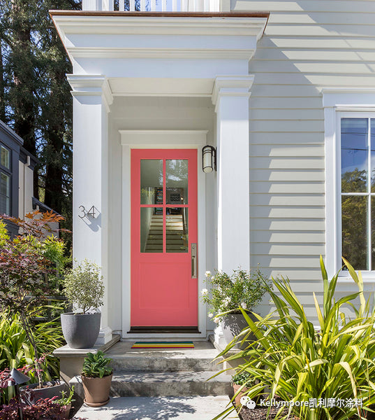
既然近段时间以来,我们会越来越多地表达自我,就不要害怕将您的粉色系列的入户门拔高到下一个层次。 对于外墙色系是温暖而中性的房子,漂亮的入户前门是将您在茫茫人群中脱颖而出的机会。 我的意思是,你好!

And since we're expressing ourselves more these days, don't be afraid to take your pink door to the next level. With warm neutral houses, the front door is your opportunity to stand out in the crowd. I mean, hello!
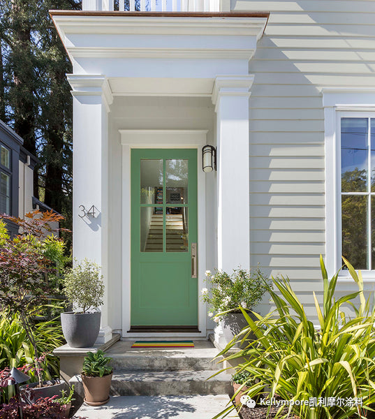
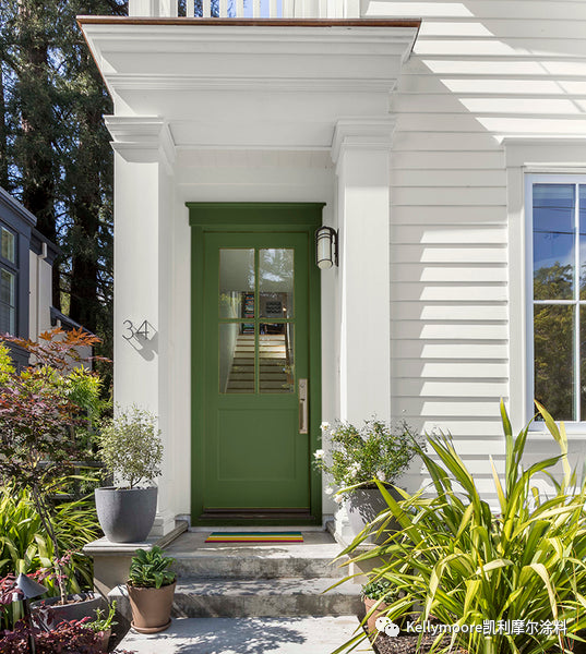
如果您不想过于招摇也不想让人为之尖叫也没关系。 这是有着和上一种方案相同的立面颜色的房屋,但入户门选用了看起来十分友好的绿色。在室外园林背景衬托下, 一切都显得那么平静祥和。

It's okay too if you don't feel like shouting. Here's the same house color with a friendly green door. The look is polished but quiet and looks lovely with the landscaping.
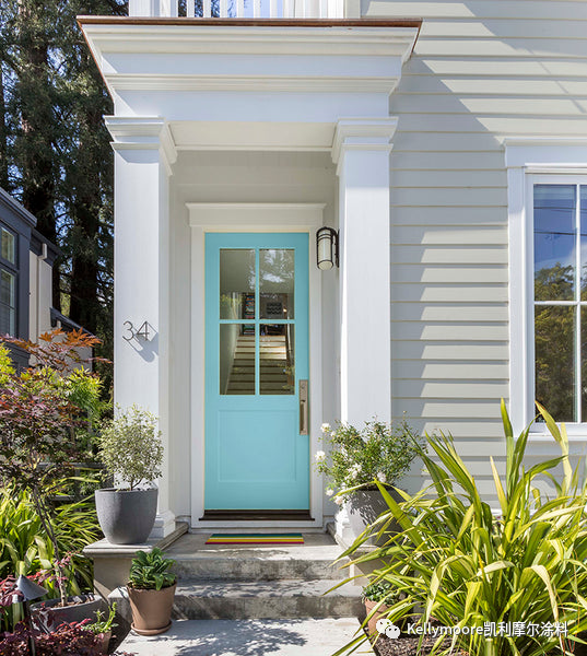
这又是一套有着和上两种方案相同的立面颜色的房屋,这次是甜美的水蓝色的入户门。 它的存在使得房屋侧线线条的颜色感觉比原来略深,从而使得整个房屋的外观看起来更欢快,更令人放松。

Here's the same house color yet again, this time with a sweet aqua blue door. It makes the siding feel a bit deeper and the whole look is both cheerful and relaxing.
我相信您已经看到了类似婚礼上的蛋糕的奶白色潮流(把整幢房子刷成同样的奶白色)。 

这会非常有趣,也感觉很酷,我很高兴现在的趋势是更加显现奶油状的白色。

奶白色的房屋的入户门厅更需要有自信和精致的感觉,您可以选择那些看似柔和但又不失奢华感的颜色来搭配。


I'm sure you've seen the wedding cake trend (houses painted all white) by now.

It's fun, it's cool, but I'm so glad the trend is going to a creamier, more buttery white.

Front doors for white houses need to feel confident and sophisticated. Choose something that's a touch muted and feels luxurious.
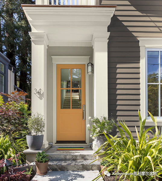
为了软化深色门廊或沉重柱子的厚实外观,门厅采用浅色的墙壁和天花来降低整个区域的对比度。 然后选择一个很棒的前门颜色,这将是属于您的特色时刻。

趋势提醒: 这种蜂蜜芒果色,正是近来无论在内墙或者外墙面,越来越多人选用的颜色!这可以让您找寻到感觉时髦和快乐的方法!


To soften the chunky look of a dark porch or heavy columns, lower the contrast for the entire area with a lighter color for the walls and ceiling. Then choose a great door color because this will be your feature moment.

Trend alert! This honey mango color is on the rise for both interior and exterior! Look for ways to incorporate it that make you feel hip and happy!
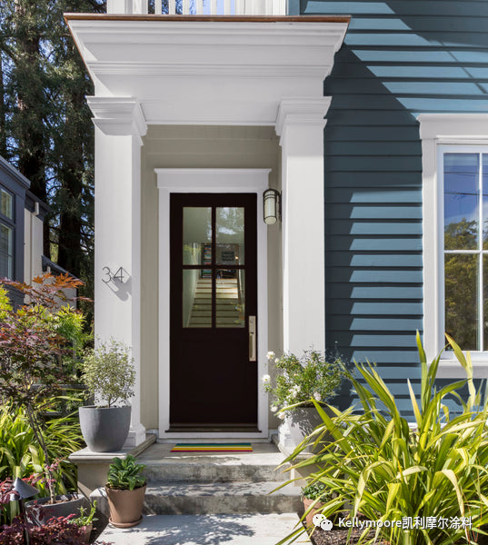
即使是最传统的门也会以最可爱的方式从门廊的柔和背景色中脱颖而出。 

自我提醒:这是我们最受欢迎的黑色------炭黑


Even traditional doors stands out in the most lovely way with a softer background color for the porch.

Note to self: this is our most popular black paint ever- Carbon!
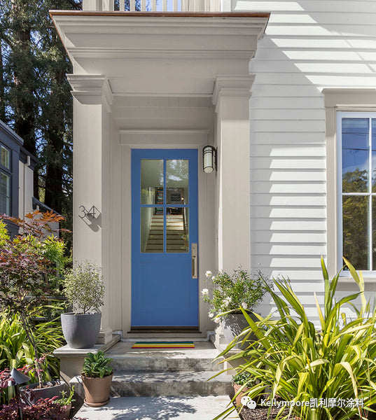
这是做同样一件事情的另一种方法。 使用与装饰线条一致的颜色来装饰整个入户门厅(包括墙壁、天花、以及线条),并确保整体色调以及入户前门颜色,可以让人有着惊艳的感觉。 

趋势提醒2:  明亮的略带红色的蓝色仍然是非常流行。 您稍加留意,就会发现从汽车到橱柜,再到入户门,所有东西上都有这种超级乐观主义的颜色。


Here's another way to do the same thing. Use the trim color for the entire porch (walls, ceiling, trim) and make sure it's a hue that looks amazing with your front door. 

Trend alert #2 Bright reddish blues are still popular. Notice this hyper optimistic color on everything from cars to cabinets and well, front doors.


这是做同样一件事情的另一种方法。 使用与装饰线条一致的颜色来装饰整个入户门厅(包括墙壁、天花、以及线条),并确保整体色调以及入户前门颜色,可以让人有着惊艳的感觉。 

趋势提醒2:  明亮的略带红色的蓝色仍然是非常流行。您稍加留意,就会发现从汽车到橱柜,再到入户门,所有东西上都有这种超级乐观主义的颜色。 

这个配色方案适用于外墙颜色稍浅或稍深的房子。 它可以使房屋看起来空间感十足,并能突出您房屋的入户门厅区域。 这款具有强烈美式风格的颜色组合再一次体现了现代色彩的变化。

顺便说一下:这三款带有红色系、米色系和蓝色系的颜色都来自于我们的历史经典色色卡,这是我们最新推出的有着历史沉淀和经典永恒的110个颜色,这是我现在最喜欢使用的色卡。 


This plan works for lighter and darker houses. It really opens up the space and shows off your front door. This Americana combo is modern again with this shift in color placement.

BTW: all of the colors on this red, white, and blue version are in THE Historic COLOR SET, our newest fandeck with 110 timeless colors- It's my favorite deck right now.
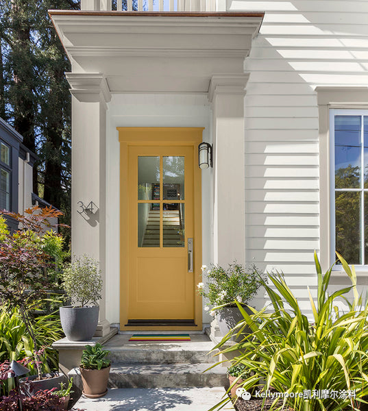
这也是我最喜欢的入户门(室内门也一样)的颜色之一,将门和门框的颜色刷成一致,这样处理可以让门的视觉感觉会更大更好看。 

这种又大又漂亮的门框看起来会更好看。 但即使是小一点或朴素一点的门框,这样的上色技巧也会让门看起来更宽广一些,看起来更有吸引力一些。 在以后的实践中我会尽可能多地使用这些技巧。


My favorite color placement for front doors (and interior doors too!) is to make them feel bigger and better by painting the door and trim the same color.

Big beautiful trim like this looks even better. But even small and plain trim feels broader and looks more attractive with this technique. I use it as often as possible.
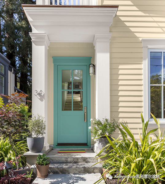
在一天结束的时候,回到家里,您可以试着重新给自己设计一个可爱的入户门厅。 

不要担心别人怎么说,不要害怕尝试一些意想不到的东西。多姿多彩的颜色会让您感到快乐,并使您的家看起来永远是那么时尚。 

更多的色彩灵感,您可以查看我们的配色方案和色彩趋势页面。 您可以大胆尝试您的想法,可以从我们的2000多种颜色中选择任何一个。


At the end of the day, coming home to a house that helps you reset begins with just a lovely front door.

Don't worry about what others say about it, and don't be afraid to try something a little unexpected. Colors that make you feel happy about your home will always be in style.

For more color inspiration check out our Color Schemes and Color Trends pages. And to try your bold ideas without a commitment, try our COLOR Swatches in any of our over 2,000 colors.


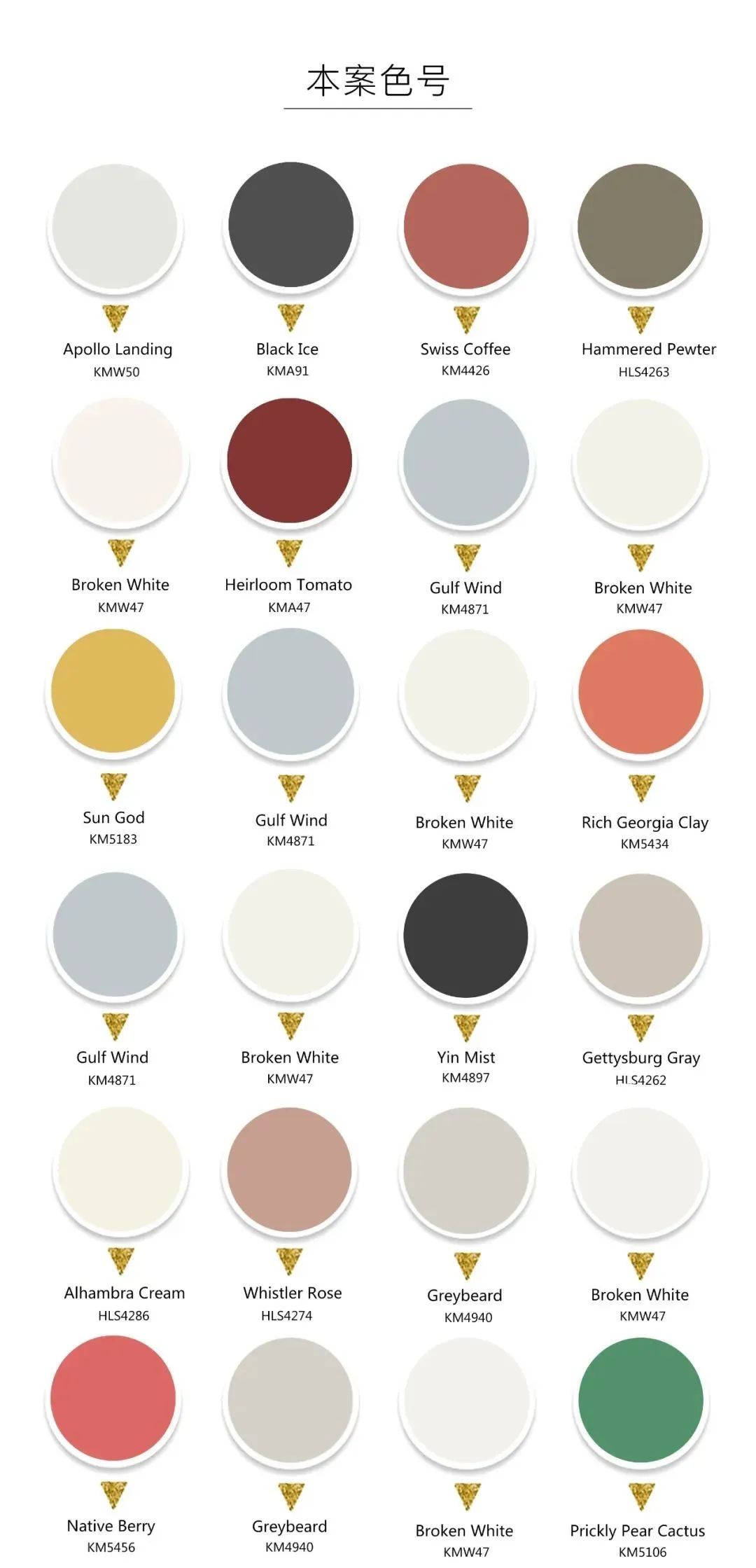
本案主色:KMW50KMA91KM4426HLS4263KMW47KMA47KM4871KM5183KM4871KMW47KM5434KM4871KM4897HLS4262HLS4286HLS4274KM4940KMW47KM5456KM4940KMW47KM5106KM4940KMW47KM5026HLS4304HLS4235HLS4263HLS4295HLS4208HLS4242HLS4270HLS4292KMW44KMW50HLS4262KM4980HLS4250HLS4202HLS4267KMW50HLS4262HLS4205HLS4236KMW44HLS4211        


时间:05-27-2022
凯利摩尔涂料:雅致与温馨,给你想要的精致生活!

PROJECT  INFORMATION项目信息每个“家”都是居住者个性的体现

NAME - 项目名称:沉淀
LOCATION -
项目地点:浙江省 义乌市  香港绿地朝阳门

AREA - 项目面积:185 

DATE - 完成时间:2022

STUDIO - 设计机构:山禾边也

MAIN MATERIAL - 主要材料:岩板、KELLYMOORE进口漆、LE NATURALISME布艺、艾是墙布、Arcmooi意大利品牌灯具CAMERAMAN - 摄影师阿敏

ABOUT HOME - 关于家精装改造,吊顶,墙面,灯光、木饰面、柜体结构家具、窗帘、床品、餐具、装饰品


家永远是让人最放松的地方,原木也是业主最喜欢的装修元素,从老房子里带进的情怀,结合新房内现代的表现手法,很好的完成了从外到家的空间转换,让人感到放松与舒适。

Home is always the most relaxed place, log is also the owner's favorite decoration elements, from the feelings brought into the old house, combined with the modern performance techniques in the new house, very good to complete the space conversion from outside to home, let a person feel relaxed and comfortable.、


PART02

                                                                                        容和生机


玄关| HALLWAY

玄关柜内有收纳,镂空格的增加整个柜面的透气性,抽屉的设计能方便的放置进门随手需要摆放的小物件,很实用。

There is receive inside porch ark, the air permeability that adds whole ark face of engraving blank, the design of drawer can be conveniently placed take the door with the small thing that needs to put, very practical.


客厅| LIVING


微风拂面,在阳光明媚的日子里,坐在客厅,吃着零食,看着书,悠闲地度过美好的一天。

Sitting in the living room on a sunny day with a breeze on your face, eating snacks, reading a book and having a nice day out.


客房开门设计,隐藏在客厅的电视墙背景里。

Guest room door design, hidden in the living room TV wall background.

精装形式呈现比较常规,房子有硕大的落地玻璃移门,沙发背景墙背景墙用原木整体打造,适当结合封闭的玻璃开门以及敞开式蓝色柜格,,自然质感浑然天成,办公休闲两不误,空间的格调显得温馨而雅致。

Hardcover form is more conventional, the house has a large floor glass door, sofa background wall background wall with logs to build the whole, appropriate combination of closed glass door and open blue cabinet, natural texture is natural, office leisure is not a mistake, the style of space appears warm and elegant.


                                                                                     ▽

客厅电视柜蓝色开放柜和木色封闭柜结合,高靠背沙发从形式上虽然不是最优的选择,可坐可躺,头部也得到了很好的依托,让人的身心得到最大的放松,十分舒适。


Cabinet of sitting room TV blue opens ark and wood lubricious close ark are united in wedlock, although tall sofa of back of a chair is not optimal choice from formal, can sit but lie, the head also got very good rely on, the body and mind that lets a person gets the biggest loosen, very comfortable.


PART02

                                                                                          容和生机


厨房| KITCHEN


PART03

                                                                                         容和生机


餐厅 | RESTAURANT 

                                                                                               ▽

业主喜欢木色,觉得比石材的更温暖,选择一款造型独特,RA高且耐用的进口灯具,质感满满。厨房原来移门换成简单的玻璃移门,使客厅、玄关、厨房及餐厅色调统一连成整体。

The owner likes wood color, which is warmer than stone, so he chooses a durable imported lamp with unique shape, high RA, and full texture. The kitchen moves the door to change simple glass to move the door so, make sitting room, porch, kitchen and dining-room are tonal and unified connect whole.

餐厅灵活结合岛台,同时设有独立厨房和开放式操作区,大岛台与木质餐桌凳相结合,空间的视觉感和区域质感十足。

The dining room is flexibly combined with the island, with a separate kitchen and open operation area. The large island is combined with wooden tables and stools, giving the space a strong visual sense and regional texture.


PART03

                                                                             心灵舒适


主卧 | MASTER BEDROOM 

主卧拆除原来的软包背景,改用木质+镂空处理,镂空处可以摆放睡前放下的书,摘下的眼镜、手表。房间延续棕色的主色调,搭配灰绿色墙布在自然光线的映衬下,营造出一种柔和慵懒的氛围。

Master bedroom dismantles original soft bag background, switch to wooden + hollow out processing, hollow out place can put the book that puts down before going to bed, the glasses that takes off, watch. The room continues its brown color palette, paired with grey-green wall cloths that create a soft and languid atmosphere against natural light.


衣帽间 |  LOCKER ROOM

   ▽

衣帽间拆除了原来敞开式的柜体,取消原本更衣室的门,对衣柜内部重新划分,满足业主私人化的使用需求,还能提高生活品质,使用起来也能愉悦主人的心情。

Cloakroom dismantled the cabinet body of original open type, cancel the door of original dressing room, divide afresh to chest interior, satisfy owner private change use demand, still can improve life quality, use rise also can cheerful master mood.


次卧 |BEDROOM  

次卧的调性延续整体的风格,蓝灰的墙布,使空间显得静谧而安宁,没有过多的修饰,恰到好处的点缀让空间保持本原的姿态和灵性,柜体的设计将收纳和置物功能考虑周全,舒适宜人而实用。

Second lie the tone sex continues the style of whole, the wall cloth of blue ash, make the space appears quiet and peaceful, do not have overmuch decorate, proper ornament lets a space maintain original attitude and intelligence, the design of cabinet body will receive and buy content function to consider all round, comfortable and pleasant and practical.


客房 |GUEST BEDROOM  


客房床头背景木色+浅色弧形波浪板,大量的木元素为房间的主人提供一个温馨的入睡环境。

The background of the bed in the guest room is wood color + light arc wave board, and a large number of wood elements provide a warm sleeping environment for the owner of the room.


PART04

                                                                                          惬意思考


书房 |STUDY 

书房,让阅读空间也优雅、精致,并充满生活情调。更是凭借着木质和玻璃的结合,将极简书房发挥到极致。书房既是办公室的延伸,又是家庭生活的一部分。

Study, let reading space also elegant, delicate, and full of life emotional appeal. It is the union with more by virtue of woodiness and glass, develop extremely simple study acme. The study is the outspread of the office since, it is one part of domestic life.


卫生间 |TOILET

更换原有的柜门板来统一风格色调,作为每个人家中不可或缺的一部分,细节的融合还是很重要的。

Replace original cupboard door board to unify style tonal, regard as the indispensable one part in every family, the confluence of detail is very important still.


PART04

改造前(精装改造)


本案主色:KM4906KM4910      


时间:05-19-2022
凯利摩尔涂料:独屋挑战设计专题:没有想到您会拥有一幢蓝色房子?


尽管在一年前我们刚搬进来的时候,我就想把我们艺术工作室的建筑外墙粉刷一下,但在我们清理和修复这个很酷的老房子之前,多花点时间考虑给其选择合适的颜色肯定是值得的。

As much as I wanted to paint our art studio building as soon as we moved in a year ago, it was worthwhile taking the time to consider my color options as we gutted and repaired this cool old place.


以下您可以快速浏览一下,我为任何建筑选择涂料颜色的过程,以及如何找到完美的、与之匹配的、和让其焕发奕奕光彩的颜色。

Here's a quick look at my process for choosing paint colors for any building, and how it helped me arrive at the perfect color for us.


·照片旁白:(我们的工作室位于一个转角地段,面对着连绵起伏的山丘,有着开阔视野 


需要考虑的要素:

Consider the set things:


建筑风格——这是一幢规模较小且不具任何特色的建筑,门窗尺寸与建筑极不协调,简单的现代建筑外形,有着圆齿形壁板的侧檐。

· Style of the building - fairly small non-descript building with a funny combination of mismatched window sizes, a simple modern shape, and scalloped eve siding.


地理位置——位于小镇边缘,可以俯瞰着长满橡树的连绵起伏的山丘。景色随着季节的变化而变化,令人陶醉。

· Location - on the edge of town overlooking rolling hills spotted with oak trees. The views are amazing and change dramatically with the season. 


 · 照片旁白:(我们的邻居虽然不多,但他们每天都会开车经过我们所在的转角 


 · 照片旁白:周围上坡上草的颜色会随着季节的不同而变化,从炽橙色到亮绿色。 


您想实现的效果:

What do you want to create?:


一些感觉虽然传统但不失新颖的东西。 这附近的大多数房子都是白色、棕色或绿色的。虽然这些颜色都很漂亮,但我想和它们的颜色有些对比及反差。

· Something that feels traditional but fresh. Most homes around here are white, tan, or green. Lovely colors, but I want to rev things up a bit.


相比工作室,我更想要我们的房子有着一个与众不同的颜色,所以我需要的颜色将看起来很棒,内敛而不张扬。

· I want our house to be a different color than the studio, so I need colors that will look great (not distracting) together.


应该是让整个建筑看起来和谐统一并干净利落的颜色。 整个建筑必须是使用同一种颜色。

· Something that makes the building feel unified and clean. The entire building has to be one color.


缩小选择范围

Narrow down your options:


我马上翻看起我们最新的扇形色卡,历史经典色卡(The Historic Color Set),这是我们将美丽的历史传统色彩做的一本集合色卡。 这一步就把我的选择范围从凯利摩尔涂料的3000多种颜色缩小到110种颜色。 


· Immediately I went to our newest fandeck, THE Historic COLOR SET, with our beautiful collection of traditional colors. This step alone narrows my options from almost 3,000 colors to a 110 hues with a proven past.


我把白色系列和绿色系列的色卡放在一边。 (记住我前面说过我想要的是一些不一样的颜色)这让我的颜色选择减少到了50种左右。


· I set aside the white and green colors of the deck aside. (remember I wanted something a little different) This brought my color options down to about 50.


考虑对你来说印象最为突出的颜色:

Consider the colors that stand out to you:


当我在在一天中不同时段不同的光线下绕着这幢小楼走的时候,我就已经被被蓝色所深深吸引。HLS4227(迷雾蓝Stieglitz Fog)是历史经典色中最有深度的蓝色之一,在成群的橡树林、马路对面的黄色山丘以及天空的映衬下,这感觉太令人惊叹…… 这个颜色深沉又不失柔美,并能在周围植物的映衬下,显得温馨恬美。


· As I walked around the building in different light at different times of day, I was drawn to the blues. Stieglitz Fog HLS4227 is one of the darkest blues in THE Historic COLOR SET, and it felt amazing against the oak trees, the yellow hills across the street, the sky... It has a soft warmth that enhances the warm plant colors around it.


我知道深一点的颜色似乎会退色,但这在这种情况下,一切都是完美的。 为什么? 就像我想要一个华丽动人的涂料颜色一样,我真心希望这样配色能突出我们的橡树林以及自然景观,这才是重点。 


· I know that darker colors seem to recede, which in this case is perfect. Why? As much as I want a gorgeous paint color, I really want our oak trees and natural landscape to be the focus. 


我选择颜色的一般原则是,如果立面线条和门是建筑物中漂亮的建筑元素,我就会用与主体不同的颜色来进行突出涂饰。


My general rule for placing color is that I only paint elements like trim and doors in a different color from the body if they're beautiful pieces of architectural.


在这个案列中,如果选用不同的颜色来涂饰,将突出原本并不协调和令人尴尬的门窗和侧裙护檐比例。 所以我选择把所有的东西都涂成蓝色,除了房顶新安装的闪烁金属围挡和房子背面的市政箱子,它们的自然金属颜色,很容易让人有着现代工业的触感。 


In my case, painting the trim would've highlighted the mismatched windows and awkward scale of the overhang. So I chose to paint everything blue except the new metal flashing at the top and utility boxes on the back in their natural metal color for an industrial touch.


花点时间考虑一下您房子的风格和细节,景观和周围环境,以及每天你想要的感觉,这将帮助缩小您的选择范围,直至找到最适合您的心仪颜色。 


Taking the time to consider the style and details of your house, the landscape and surroundings, and how you want to feel when you pull up to it every day will help you narrow down your options to the perfect color for you.


本案主色:HLS4227       


时间:05-07-2022
凯利摩尔涂料 :2022年06月宣传海报

6.01-国际儿童节

6.03-端午节

6.05-世界环境日

6.06-芒种

6.19-父亲节

6.21-夏至

6.23-奥林匹克日

时间:05-05-2022
杭州楷模贸易有限公司 备案号:浙ICP备2022022646号-1