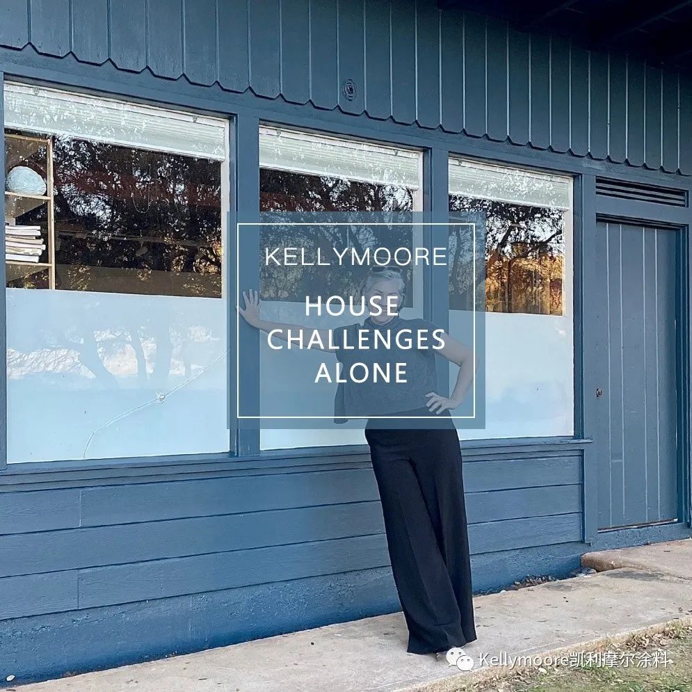
尽管在一年前我们刚搬进来的时候,我就想把我们艺术工作室的建筑外墙粉刷一下,但在我们清理和修复这个很酷的老房子之前,多花点时间考虑给其选择合适的颜色肯定是值得的。
As much as I wanted to paint our art studio building
as soon as we moved in a year ago, it was worthwhile taking the time to
consider my color options as we gutted and repaired this cool old place.
以下您可以快速浏览一下,我为任何建筑选择涂料颜色的过程,以及如何找到完美的、与之匹配的、和让其焕发奕奕光彩的颜色。
Here's a quick look at my process for choosing paint
colors for any building, and how it helped me arrive at the perfect color for
us.
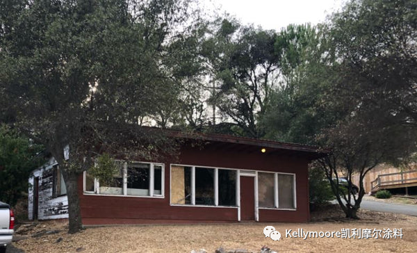

·照片旁白:(我们的工作室位于一个转角地段,面对着连绵起伏的山丘,有着开阔视野 )
需要考虑的要素:
Consider the set things:
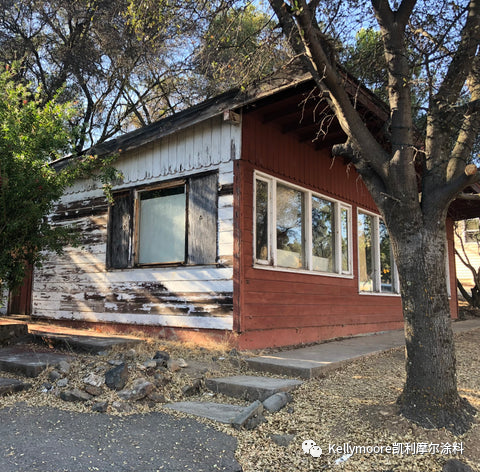
建筑风格——这是一幢规模较小且不具任何特色的建筑,门窗尺寸与建筑极不协调,简单的现代建筑外形,有着圆齿形壁板的侧檐。
· Style of the building - fairly small
non-descript building with a funny combination of mismatched window sizes, a
simple modern shape, and scalloped eve siding.
地理位置——位于小镇边缘,可以俯瞰着长满橡树的连绵起伏的山丘。景色随着季节的变化而变化,令人陶醉。
· Location - on the edge of
town overlooking rolling hills spotted with oak trees. The views are amazing
and change dramatically with the season.
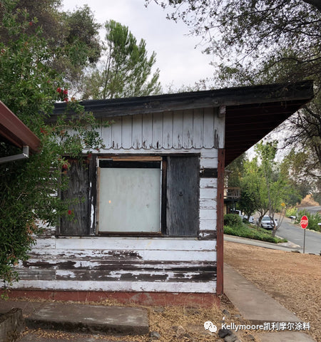
· 照片旁白:(我们的邻居虽然不多,但他们每天都会开车经过我们所在的转角 )
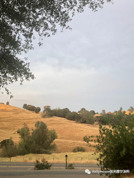
· 照片旁白:周围上坡上草的颜色会随着季节的不同而变化,从炽橙色到亮绿色。
您想实现的效果:
What do you want to create?:
一些感觉虽然传统但不失新颖的东西。 这附近的大多数房子都是白色、棕色或绿色的。虽然这些颜色都很漂亮,但我想和它们的颜色有些对比及反差。
· Something that feels
traditional but fresh. Most homes around here are white, tan, or green. Lovely
colors, but I want to rev things up a bit.
相比工作室,我更想要我们的房子有着一个与众不同的颜色,所以我需要的颜色将看起来很棒,内敛而不张扬。
· I want our house
to be a different color than the studio, so I need colors that will look great
(not distracting) together.
应该是让整个建筑看起来和谐统一并干净利落的颜色。 整个建筑必须是使用同一种颜色。
· Something that makes the
building feel unified and clean. The entire building has to be one color.
缩小选择范围
Narrow down your options:
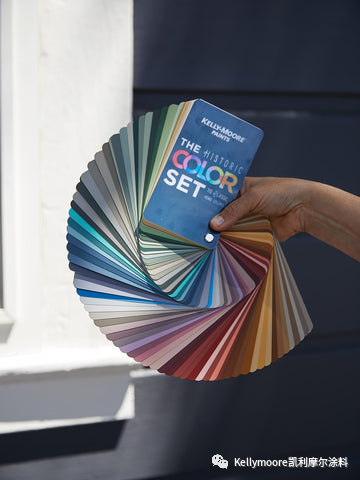
我马上翻看起我们最新的扇形色卡,历史经典色卡(The Historic Color Set),这是我们将美丽的历史传统色彩做的一本集合色卡。 这一步就把我的选择范围从凯利摩尔涂料的3000多种颜色缩小到110种颜色。
· Immediately I went to our
newest fandeck, THE Historic COLOR SET, with our beautiful collection of
traditional colors. This step alone narrows my options from almost 3,000 colors
to a 110 hues with a proven past.
我把白色系列和绿色系列的色卡放在一边。 (记住我前面说过我想要的是一些不一样的颜色)这让我的颜色选择减少到了50种左右。
· I set aside the white and
green colors of the deck aside. (remember I wanted something a little
different) This brought my color options down to about 50.
考虑对你来说印象最为突出的颜色:
Consider the colors that stand out to you:
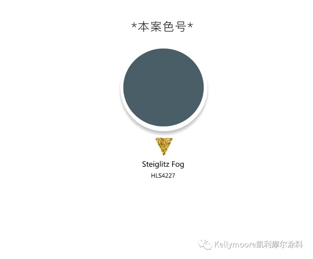
当我在在一天中不同时段不同的光线下绕着这幢小楼走的时候,我就已经被被蓝色所深深吸引。HLS4227(迷雾蓝Stieglitz Fog)是历史经典色中最有深度的蓝色之一,在成群的橡树林、马路对面的黄色山丘以及天空的映衬下,这感觉太令人惊叹…… 这个颜色深沉又不失柔美,并能在周围植物的映衬下,显得温馨恬美。
· As I walked around the
building in different light at different times of day, I was drawn to the
blues. Stieglitz Fog HLS4227 is one of the darkest blues in THE
Historic COLOR SET, and it felt amazing against the oak trees, the yellow hills
across the street, the sky... It has a soft warmth that enhances the
warm plant colors around it.
我知道深一点的颜色似乎会退色,但这在这种情况下,一切都是完美的。 为什么? 就像我想要一个华丽动人的涂料颜色一样,我真心希望这样配色能突出我们的橡树林以及自然景观,这才是重点。
· I know that darker colors
seem to recede, which in this case is perfect. Why? As much as I want a
gorgeous paint color, I really want our oak trees and natural landscape to be
the focus.
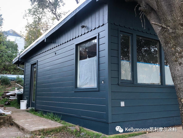
我选择颜色的一般原则是,如果立面线条和门是建筑物中漂亮的建筑元素,我就会用与主体不同的颜色来进行突出涂饰。
My general rule for placing color
is that I only paint elements like trim and doors in a different color from the
body if they're beautiful pieces of architectural.
在这个案列中,如果选用不同的颜色来涂饰,将突出原本并不协调和令人尴尬的门窗和侧裙护檐比例。 所以我选择把所有的东西都涂成蓝色,除了房顶新安装的闪烁金属围挡和房子背面的市政箱子,它们的自然金属颜色,很容易让人有着现代工业的触感。
In my case, painting the trim
would've highlighted the mismatched windows and awkward scale of the
overhang. So I chose to paint everything blue except the new metal flashing at
the top and utility boxes on the back in their natural metal color for an
industrial touch.
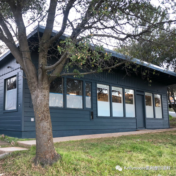
花点时间考虑一下您房子的风格和细节,景观和周围环境,以及每天你想要的感觉,这将帮助缩小您的选择范围,直至找到最适合您的心仪颜色。
Taking the time to consider the
style and details of your house, the landscape and surroundings, and how you
want to feel when you pull up to it every day will help you narrow down your
options to the perfect color for you.
本案主色:HLS4227
